Stay informed by signing up to receive our email newsletter

|
Tuesday 4th September 2018 at 08:41 By Rob |
 |
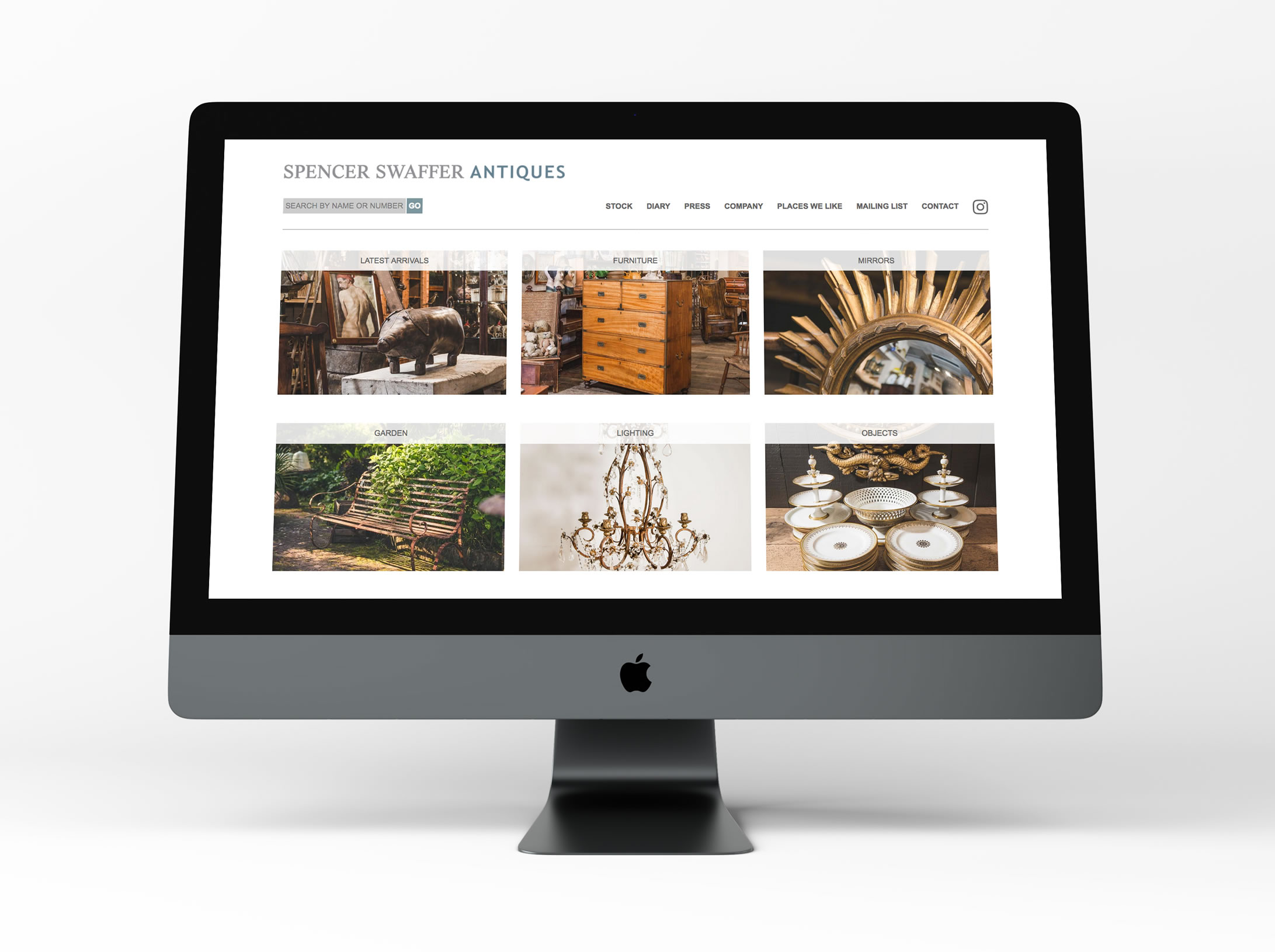
We've just completed a website re-build for the lovely Spencer Swaffer. With Spencer's old website getting on a bit in years, we've just completed a re-build of it, using the existing design.
Read on to find out more the new features and what the upgrade has entailed!
Many computer screens, laptop screens, as well as mobile & tablet screens such as the iPad & iPhone are now "retina". This is also referred to as 4K, 5K etc.
This means that these screens can display pictures (like images of your stock), in a much higher and deeper resolution; making the picture feel much more real, and delivering enhanced clarity.
The new Spencer Swaffer website takes advantage of retina technology, and now displays newly uploaded images in retina format.

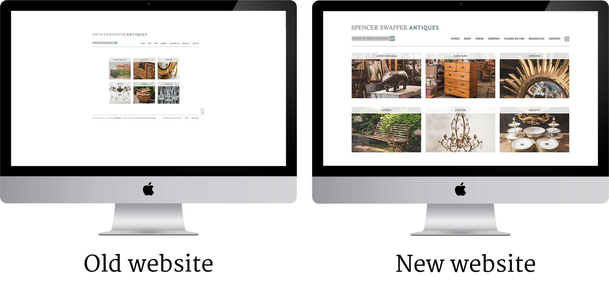
Spencer's old website would look quite small on a large screen.
Back when the old website was created, screens weren't as big, and not many people had big computer flat screens as they were expensive! So rather than the average computer having a 17" screen like it did back then, screens like a 27" iMac are really common these days so it's important the site looks good on a big screen.
The new website makes much better use of the space, and everything appears larger, whilst still feeling spacious.
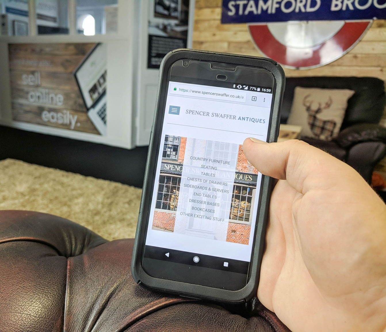
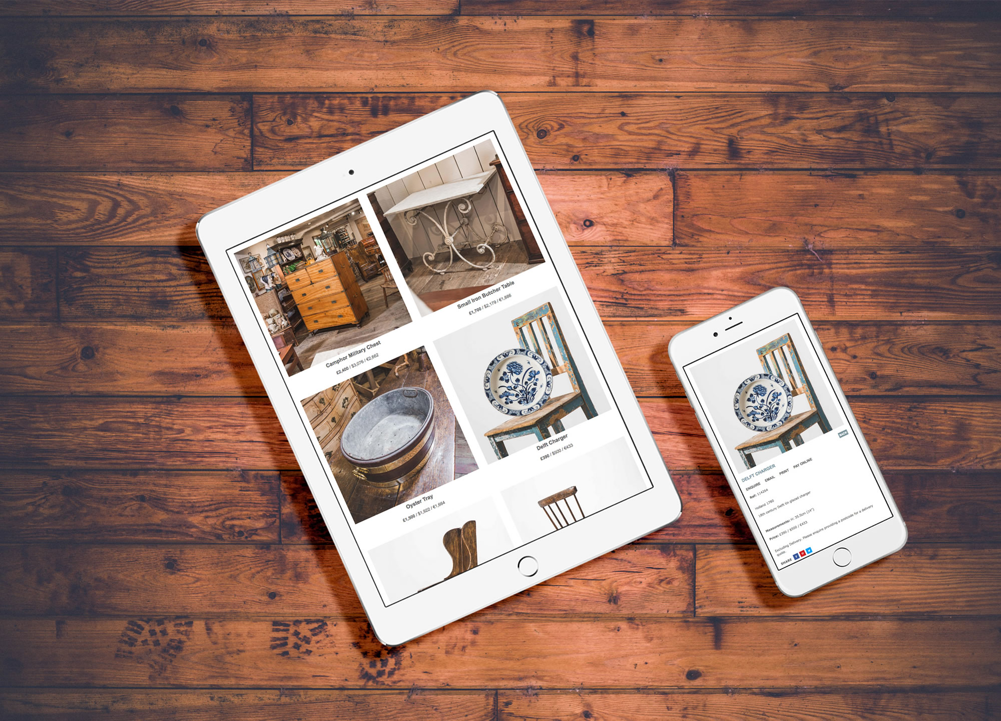
The previous website wasn't mobile & tablet responsive. This means to use the website you would have use two fingers, and "pinch & zoom" in and out and swish around the page to view everything, or navigate around, as is the case with all non mobile responsive websites. This was rather laborious, and websites which aren't mobile & tablet responsive can cost you visitors through people's impatience. Worse still, if your website isn't mobile & tablet responsive, it can appear lower in Google's rankings!
That isn't the case with Spencer's website anymore however!
His new website:-

It will take Google a few weeks to update, so as of now it's early days, but we've performed a major overhaul of the way Spencer's website is structured and search engine optimised, meaning over the coming weeks it will start to rank much better in Google.
"ph9 made it a very easy experience for us"
You can see Spencer's new website here:-
We can help you sell online easily too!
We have been businesses sell online easily since 2004, and we can help you too.
If you need a new website for your business, contact us on...
Click here to contact us by email
or call us onAs well as a hand held service, all our customers receive a copy of our marketing tips book which gives you lots of tips and advice on this on how to succeed online.


